

Today we make this.
You will need Adobe After Effects which is included in the Creative Cloud subscription along with Premiere, Photoshop, Illustrator, and everything else you need to make incredible content. Sign up via that link and you’ll be helping to support free guides like today’s article.
The RGB Effect
This prism like effect is basically some RGB displacement and blur. Not nearly as complicated as it looks.
The obvious use of this is customizing it with your own text for titles or captions, so if you’re new just follow along and you’ll have a cool project you can play with by the end and reuse for other things.
But I’d strongly encourage you to experiment with each component here and find ways to apply it. The big chunks are motion keyframing which is covered here, splitting the graphic into its color channels on different layers, the Posterize effect, and some motion blur we will make by hand.
Yes, I know you’re busy but remember that content skills compound over time and will make you better at working with a team when you’re ready to outsource it to others.
The Effect Step by Step
Make a new composition and call it TEXT. 2000x2000px is fine, 30fps. I’m going to make it 25 seconds long. Not necessary, but its nice to have the space if I want to reuse this later with a longer chunk of text.
Now create a text layer in TEXT and type BANKS ARE ZEROS. I’m using Akira Expanded Super Bold font at 150px. Put each word on a new line and center everything by using the Align tab. If you can’t see the tab, go to Window > Align in the top drop down menus, next to the Help dropdown.
This is our starting graphic.

Next we’re going to need to create a Map that won’t be directly visible in the final result, but its contents will affect what we see.
(Another technique to keep in the back of your head next time you need to put the sauce on some plain looking graphics)
Make a Map
Make another Composition of the same size and length and name it MAP.
Inside of MAP, create a new solid layer, search the Effects and Presets pane for Gradient Ramp and drag that on to your solid layer. You will see it change from a solid color to this:
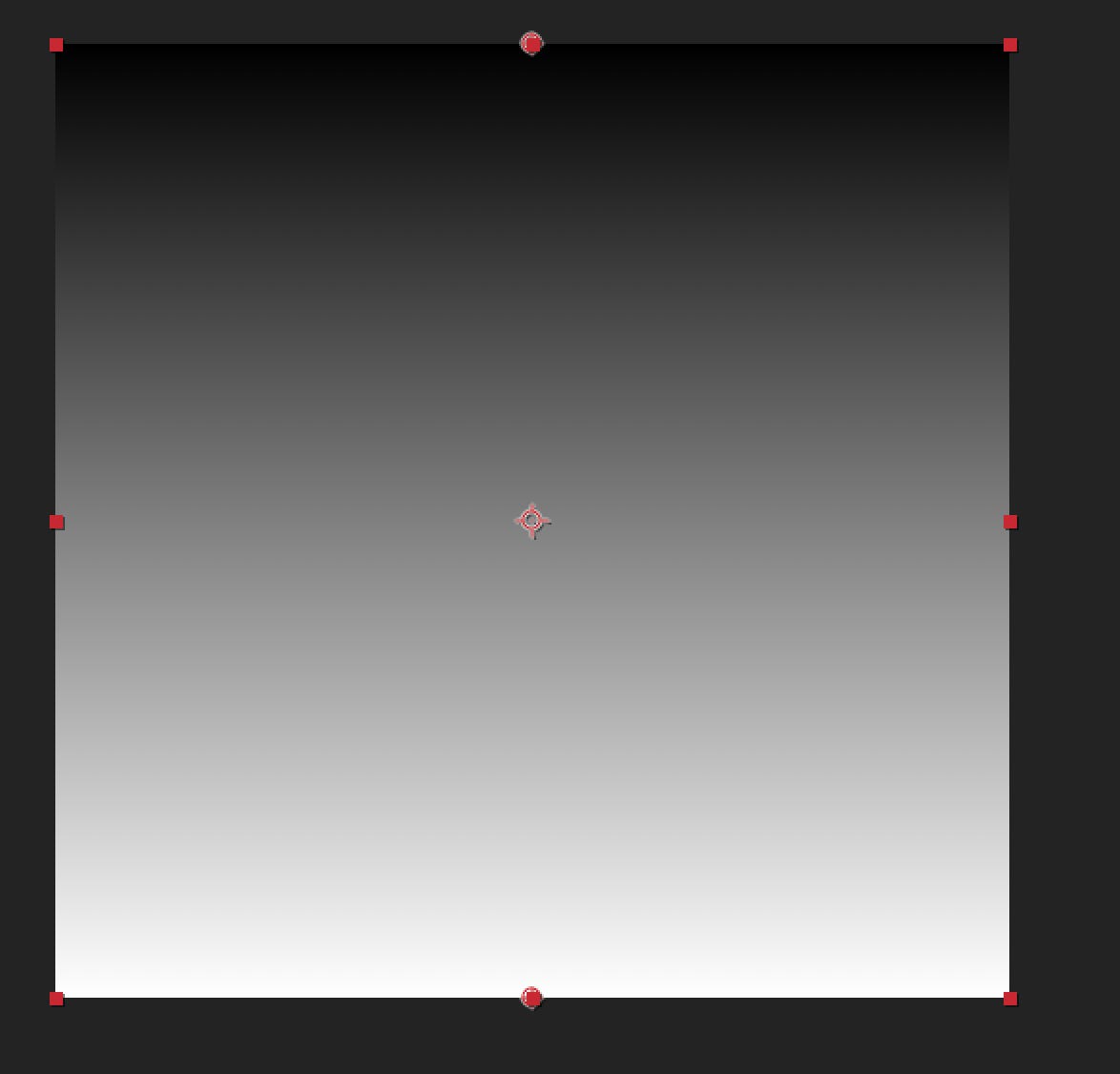
Search for the Posterize effect in the same menu, add it, and the Gradient will be quantized into a few zones. You can control how many with the Levels control in the effect menu. When you’re done with the guide, this is a good setting to tinker with later.

Make another Composition with the same settings and call it MAIN. Open it and drag in your TEXT comp and MAP comp, then make the MAP comp invisible by unchecking the little eye icon all the way to the left of the layer.

Add the Displacement Map effect (search Effects and Presets menu as usual) to the TEXT layer. Max horizontal displacement should be set to 0 and the Displacement Map Layer should be set to MAP.
Now drag the Max Vertical Displacement Slider into the negative values and watch what happens. You’ll start to see the beginnings of the effect. We’re going to keyframe the motion and blur the displacements to help keep the focus on the main text.

One problem you may have is the word “BANKS” is getting cut off. Toggle your MAP layer back on to see why:

I’m going to open up the MAP Comp and adjust my Posterize effect to have 19 Levels instead of 7.
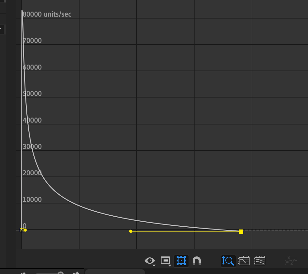
Drag the Max Vertical Displacement way way into the negatives to make your text disappear completely. In my project this is a little over -10,000. Set a keyframe at the start of the Comp.
Move the playhead in the timeline to about 1 second later and set another keyframe and give this parameter a value of zero.
Highlight both keyframes and hit F9 to add easing curves to smooth out the motion. Additionally, instead of using a dome shaped motion speed, I opened up the Speed Editor and used the yellow handles to make the motion start quickly and slowly ease to a stop.
Here’s a clip of what this looks like in motion by this step:
https://twitter.com/BowTiedTamarin/status/1655634725522776066?s=20
(Sry for no embed. Chris Best and Elon are frenemies now.)
Blur Me Like One Of Your French Girls, Jack
The motion is nice, but it looks very digital. Lots of hard edges. Various blur effects help smooth this out and are honestly a ton of the After Effects magic that add that extra something to animations. Search Directional Blur and add it to your TEXT comp layer in the MAIN compositon.
In the effect controls, set the Blur Length to 0 and drop a keyframe at the start. Somewhere in the middle of the animation, drop another keyframe with the Blur Length set to 60ish.

Put the playhead directly over the keyframe where your motion stops. Set a 3rd KF with the Blur Length back at 0.
There are other times when we can just click the Motion Blur box and After Effects will do the hard work for us, but when that isn’t possible due to the way Pre-Comps are nested, this is how you can create a motion blur effect by hand pretty quickly and apply it to anything. Keep this one in your mental toolbox.
Remember what we did to adjust the motion in the Speed Editor for the last step? Do the same thing to the Blur Length keyframes. F9 to set easing then adjust the speed so most of the action occurs in the middle of the animation like this:

This makes sense if you think about it. The text should be the most blurry when it’s moving around the most at the fastest rate of speed.
This is a huge part of making things look convincing in motion software. Think about how something would literally move step by step in real life and be able to explain it in great details, as well as how you would perceive those events.
For confidence, here is what my video looks like at this stage: https://twitter.com/BowTiedTamarin/status/1655642053944958980?s=20
RGB Effects and Final Touches
We’re nearly done at this point, we just need to add the RGB displacement that makes this really pop.
Select both the TEXT and MAP layers in your Comp, right click, and select Pre-Compose and name this Pre-Comp RGB
Now you have everything on one layer. Add the Shift Channels Effect to this layer.
Set Take Red from to Red, then the other two color channels to Full Off. Your text will unsurprisingly, turn Red.
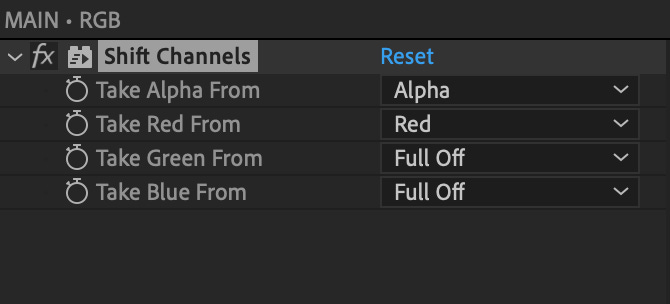
Duplicate your Pre-Comp 2 more times and repeat these steps respectively for the Blue and Green channels. For example your Green layer should have Take Red and Take Blue set to Full Off and Take Green set to Green.
Rename the layers respectively and change the blending mode from Normal to Add.

At this point the 3 color channels will all sum to white and your animation will look exactly the same.
To get the color separation for the prism like effect, simply move each layer over a few frames so they arrive into position at slightly different times. Where they overlap it will turn white because the colors sum, then we see individual color channels where they don’t.

As a final step, if you don’t want the ending text to be too blank and clean looking, move the position of each layer slightly to the right or left and adjust the Scale of each layer to be slightly different. 5-10 pixels is enough.
Then add slightly different instances of Glow Effect to each layer to soften the look and we get the final result as the video at the top of the email.
Your Feedback
Let me know how you do with this and if having more video examples is helpful.
I’m posting some examples as tweets simply to help people find the newsletter and encourage sign ups, but I’m also looking into some different formats for this newsletter.
A lot of people prefer to read because they can work at their own pace (me included) but I might try some different formats for these guides like a text version for free subs and a video demo for paid subs.
But it would be great to hear from you directly on this. If you have any opinions on what would be most helpful for you, let me know.
Thanks for reading and have a great week.
